The Type That Swings
A field guide to Reid Miles’ Blue Note typography — how one designer gave jazz its visual language, one typeface at a time
Between 1956 and 1967, Reid Miles designed some 350 album covers for Blue Note Records. He was paid fifty dollars apiece. He reportedly preferred classical music. And he permanently shaped how the world sees jazz.
Working with photographer Francis Wolff‘s intimate black-and-white session shots, Miles built a visual vocabulary so distinctive that a Blue Note cover is recognizable from across a record store — even face-down, even without the logo. Bold tinting. Radical cropping. Asymmetric layouts that feel like visual improvisation. But the real secret weapon was always the type.
Miles didn’t have a house font. He never settled into a system. He pulled from a deep crate of typefaces the way a soloist pulls from a vocabulary of licks — sometimes delicate, sometimes brutal, always in service of the music. What follows is a guide to the fonts he reached for most, the history behind each one, and the covers where they sang loudest.
Trade Gothic
Jackson Burke · 1948 · Mergenthaler Linotype · Grotesque sans-serif
If Blue Note had a default font, it was Trade Gothic. Jackson Burke designed the initial cuts in 1948 while serving as director of type development at Linotype, and kept adding weights and widths for the next twelve years — eventually building out 14 styles. The result was a family with more personality than polish: slightly irregular proportions, a bold weight that’s actually more condensed than the regular (the opposite of convention), and a kind of workmanlike honesty that later, more rationalized sans-serifs like Helvetica deliberately ironed out.
That irregularity is exactly what Miles loved. Trade Gothic has an airiness to its spacing that keeps it from ever feeling sterile. It plays well with others. And in its Extended width — stretched wide and set enormous — it could dominate a cover without overwhelming Wolff’s photography.
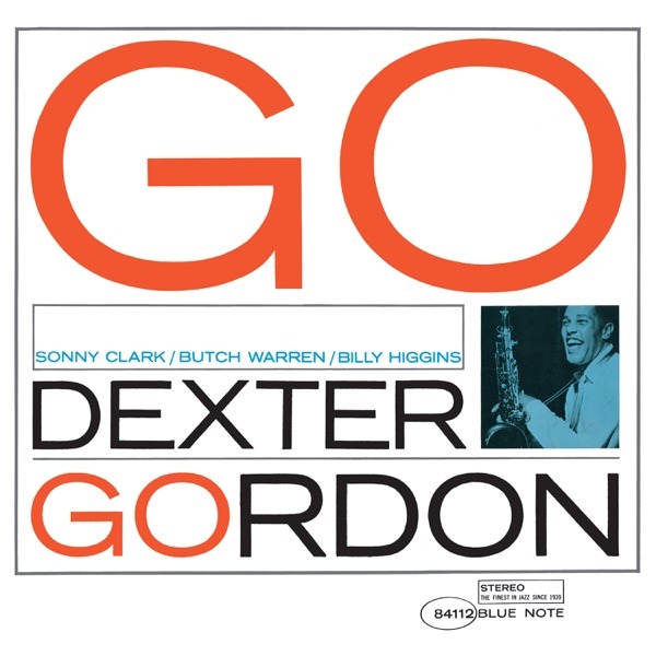
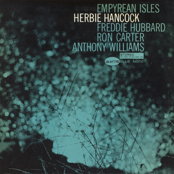
On Herbie Hancock‘s Empyrean Isles (1964), Trade Gothic appears in its purest deployment — the type floating against Hancock’s blue-tinted portrait, understated and confident. On Dexter Gordon‘s Go! (1962), Miles blew Trade Gothic Extended up to fill the frame. Just two letters. The exclamation point does the rest.
It shows up again and again — on Midnight Blue, It’s Time!, Takin’ Off, A Swingin’ Affair, Dippin’ — sometimes carrying the whole composition, sometimes as the quiet rhythm section beneath a bolder face. Trade Gothic was the bass line of Reid Miles’ design practice.
Franklin Gothic
Morris Fuller Benton · 1902 · American Type Founders · Grotesque sans-serif
Franklin Gothic arrived at the turn of the twentieth century, designed by the most prolific type designer America has ever produced. Morris Fuller Benton ran ATF’s design department for nearly four decades and is credited with over 220 typefaces — among them News Gothic, Century Schoolbook, Broadway, and Bank Gothic. Franklin Gothic was his heavyweight: dark, muscular, and unapologetically American.
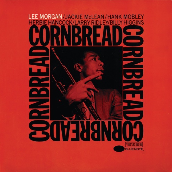
Where Trade Gothic whispers, Franklin Gothic announces. Miles used it when he needed weight and presence — often for artist names that had to punch through a busy composition. On Lee Morgan‘s Cornbread (1965), Franklin Gothic carries the artist credit alongside News Gothic for the album title — a masterclass in hierarchy. On The Rumproller (1966), it shares the composition with Trade Gothic and Trade Gothic Extended. Three weights from two families, perfectly balanced.
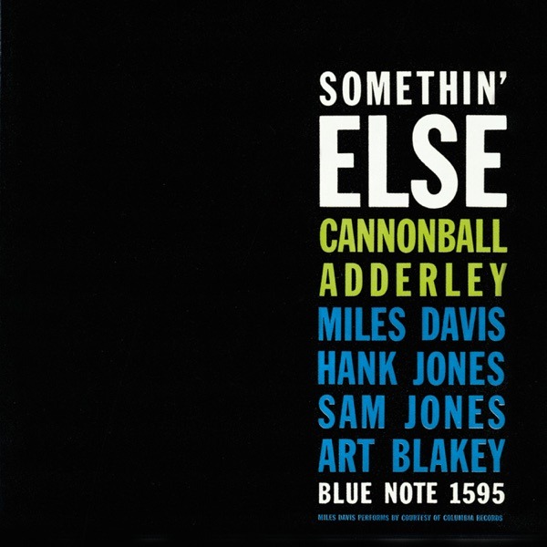
On Cannonball Adderley‘s Somethin’ Else (1958), Franklin Gothic, Bodoni, and Futura all appear on the same cover — Miles treating type like a horn section, each face taking its solo in turn.
Ultra Bodoni
Morris Fuller Benton (after Giambattista Bodoni) · 1928 · American Type Founders · Didone display
The original Bodoni typeface dates to the late 1700s, designed by the Italian printer Giambattista Bodoni during the Enlightenment. Its defining feature — extreme contrast between thick vertical strokes and hairline-thin horizontals — made it elegant but fragile at small sizes. In 1928, Benton took that contrast and cranked it to its logical extreme: Ultra Bodoni, which Fonts In Use describes as “a headline spectacular.” The thick strokes got thicker. The thin strokes got thinner. The counters became nearly rectangular.
The result is a typeface that looks like it’s shouting even when it’s standing still. Miles used it sparingly but devastatingly — almost always at enormous scale, often as the sole graphic element on covers where he’d decided the type was the design.
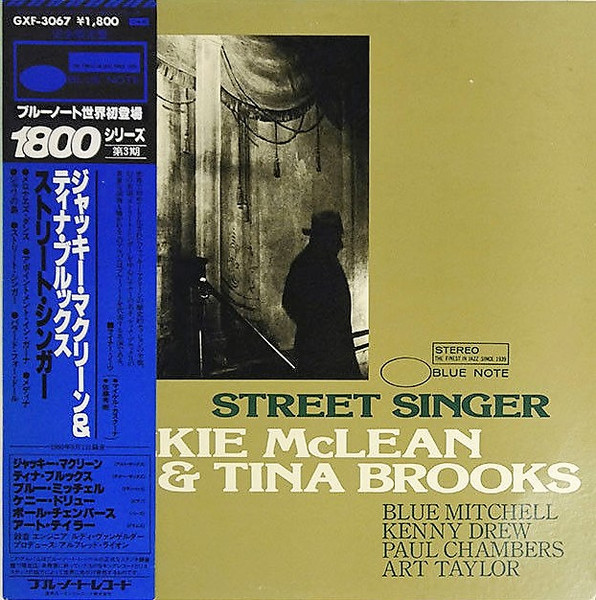
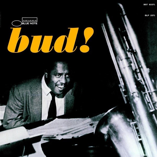
On Bud Powell‘s Bud! (1957), three letters fill the frame. Ultra Bodoni as pure graphic form, the exclamation point doing as much work as the photo. On Jackie McLean’s It’s Time! (1964), the oversized exclamation point returns — Miles loved punctuation as a design element. On Hank Mobley’s Dippin’ (1965), the apostrophe curls like a saxophone riff.
News Gothic
Morris Fuller Benton · 1908 · American Type Founders · Grotesque sans-serif
Another Benton original, and in many ways the quiet sibling to Franklin Gothic. News Gothic was drawn six years later, lighter in weight, more even in proportion, and designed with the practical demands of newspaper composition in mind. Where Franklin Gothic grabs your lapels, News Gothic just presents. Clean. Efficient. Legible at any size.
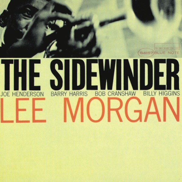
Miles often reserved it for what you might call the “rhythm section” role — secondary text, credits, catalog numbers — the information that needs to be there but shouldn’t compete with the headliner. On The Sidewinder (1964), though, he let it carry the whole cover, and it became Blue Note’s best-selling album of the era. No fireworks. Pure confidence.
It shows up in supporting roles on Cornbread, Dippin’, Happy Frame of Mind, and — paired with Roger Excoffon’s calligraphic Mistral on The African Beat (1962) — in one of Miles’ most texturally adventurous compositions.
Clarendon
Robert Besley (1845) · Hermann Eidenbenz, Haas revival (1953) · Slab serif
Clarendon is one of typography’s great survivors. Designed in 1845 by Robert Besley for the Fann Street Foundry in London, it holds the distinction of being the first typeface registered under Britain’s Ornamental Designs Act — though the protection expired after just three years and every competing foundry immediately copied it. Its defining innovation was the bracketed slab serif: where earlier slab serifs had blunt, geometric connections between serif and stem, Clarendon added a gentle curve. That small refinement made the typeface warmer, more approachable, and better suited to harmonize with regular-weight text.
The version Miles would have known is almost certainly the 1953 Haas revival by Hermann Eidenbenz — a bold, wide display face that type historian Jonathan Hoefler called “a classic that for many people is the epitome of the Clarendon style.”
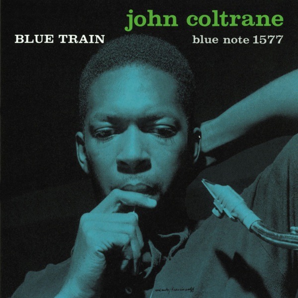
On John Coltrane‘s Blue Train (1957), Clarendon carries the title on what became one of the most recognized album covers in jazz history. Heavy, proud, unmistakable. On Art Blakey‘s The Big Beat (1960) and Lee Morgan’s Leeway (1960), Clarendon pairs with Franklin Gothic — the slab serif’s warmth balancing the gothic’s muscle.
Haas Inserat-Grotesk
Haas Type Foundry, Switzerland · c. 1950s · Grotesque sans-serif (display)
If you’ve ever wondered what Helvetica looks like after three espressos, you’re thinking of Inserat-Grotesk. Produced by the same Swiss foundry that gave the world Neue Haas Grotesk (later renamed Helvetica), Inserat-Grotesk is the ultra-bold display companion — designed to grab attention at headline sizes while maintaining the clean geometry of its more famous sibling.
Miles’ use of this face is significant because it signals just how directly he was drawing from the International Typographic Style that was reshaping American design in the late 1950s. The Swiss school championed grid-based layouts, sans-serif type, and photographic imagery over illustration — exactly the toolkit Miles brought to Blue Note.
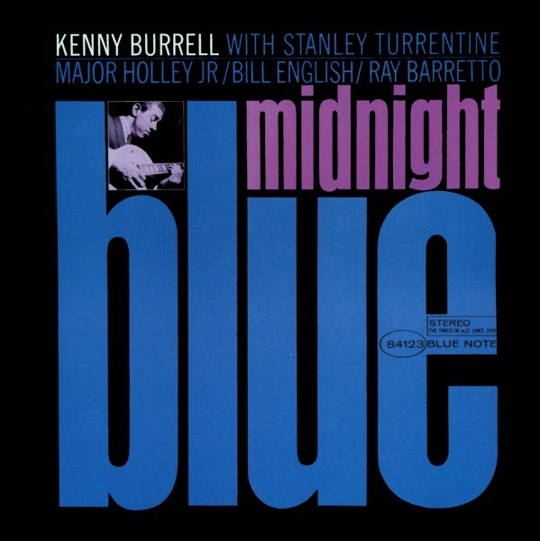
On Kenny Burrell‘s Midnight Blue (1963), Inserat-Grotesk dominates the title in a cover that’s become shorthand for Blue Note’s entire aesthetic. On Jackie McLean’s Let Freedom Ring (1963), it’s paired with Caslon 540 — creating a deliberate tension between Swiss modernism and American tradition.
Six More Faces Worth Knowing
Beyond the core six, Miles kept a deep bench. Bodoni — the refined ancestor of Ultra Bodoni — handled credits and secondary text on Somethin’ Else, Moanin’, and Bud!, its high-contrast elegance reading as sophisticated without competing with bolder display faces.
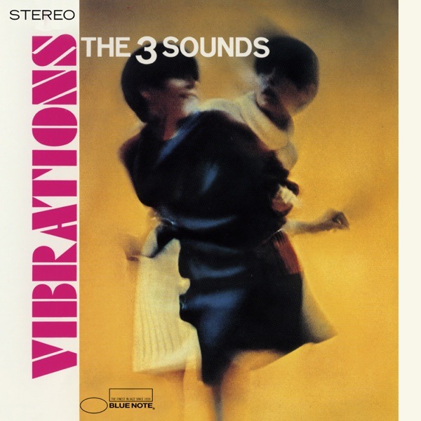
Futura Black — Paul Renner’s 1929 stencil-cut sibling of the geometric Bauhaus icon — drives the cover of The Three Sounds’ Vibrations (1966), paired with Akzidenz-Grotesk in a layout that feels almost psychedelic. Regular Futura appears on Somethin’ Else.
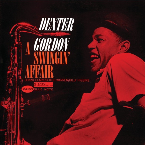
Onyx — Gerry Powell’s 1937 ultra-condensed display face with Art Deco bones — carries the title on Dexter Gordon’s A Swingin’ Affair (1962), where its compressed verticality mirrors the tall, lean silhouette of Gordon himself.
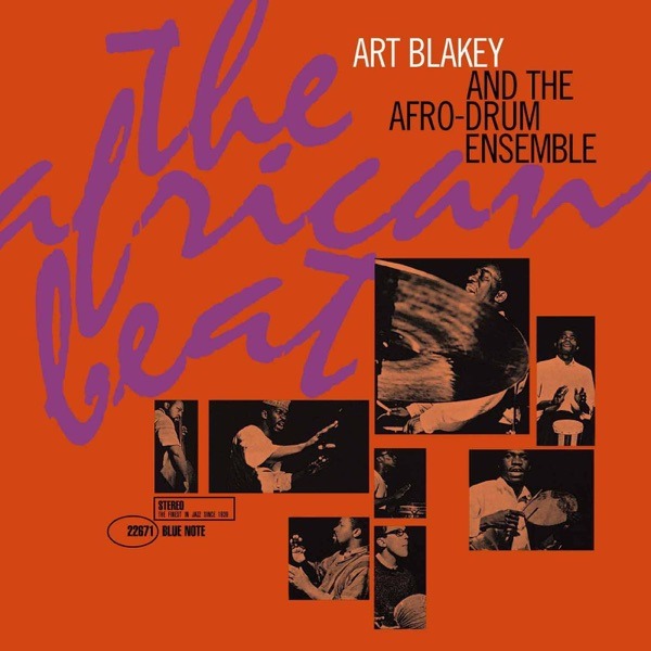
Mistral — Roger Excoffon’s 1953 French calligraphic script, which looks like someone wrote it with a felt-tip pen in one continuous motion — appears on Art Blakey’s The African Beat (1962). A rare departure from Miles’ geometric tendencies, matching the album’s Afro-Latin percussion with organic, flowing letterforms.
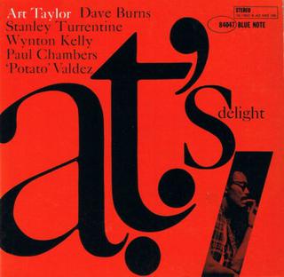
Caslon 540 — a refined display version of the venerable Caslon, one of the oldest typefaces still in regular use, first cut by William Caslon in the 1720s — appears on Art Taylor’s A.T.’s Delight (1960) and alongside Inserat-Grotesk on Let Freedom Ring.
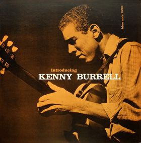
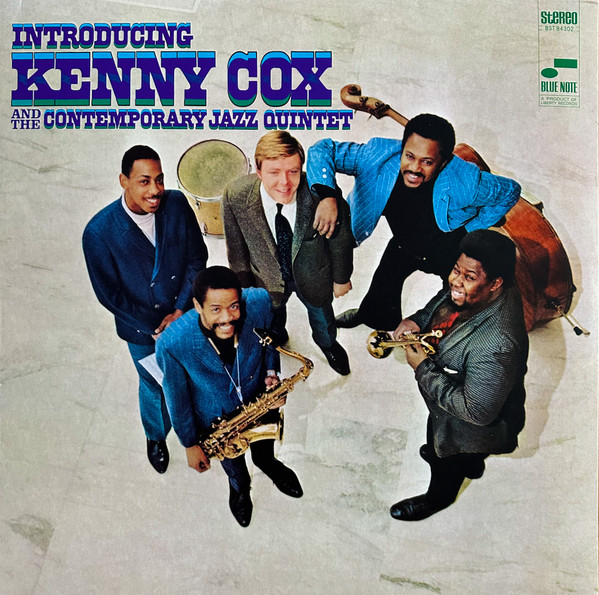
And Craw Clarendon — Freeman Craw’s 1955 American variant with rounder terminals — surfaces on Introducing Kenny Burrell (1956), one of Miles’ earliest Blue Note commissions.
Type as Horn Section
Looking at the full catalog, patterns emerge. Miles built most of his covers from a remarkably small core palette — Trade Gothic, Franklin Gothic, News Gothic, Ultra Bodoni, Clarendon — and then played them against each other the way a bandleader voices a horn section. Trade Gothic for fluidity and air. Franklin Gothic for punch. News Gothic for steadiness. Ultra Bodoni for drama. Clarendon for warmth.
His pairings were almost always sans-serif with sans-serif, or sans-serif with a high-contrast serif — never muddy combinations. And his scale relationships were extreme: the title might be twenty times larger than the credits. This wasn’t decoration. It was hierarchy as rhythm — a massive downbeat followed by a whispered pickup note.
What made it all work was restraint. Miles rarely used more than two typefaces on a single cover, and when he did (as on Somethin’ Else, with its three-font arrangement), each face served a distinct structural role. He treated the blank space of the cover the way the musicians treated silence — as an active element, not a void to be filled.
The result is a body of work that looks as radical now as it did sixty years ago. In a world drowning in visual noise, Miles’ covers remain the argument that less can swing harder.
At Kissa Kissa, we spin these records every night. The music is the point — but we’d be lying if we said the covers weren’t part of the ritual. There’s a reason you slow down when you’re flipping through a crate of Blue Note originals. Reid Miles made sure of that.
We keep nearly 480 Blue Note titles in the collection — along with more than 5,400 other jazz LPs from the 1950s through the 1970s. Come hear what they sound like on our system.